

Black Friday may be best known as a retail event, but it also changes the way people think about money. Some shoppers want to keep spending under control, others are looking for cashback, flexible payment options or a clearer view of their finances before the busiest shopping period of the year.
That creates an opportunity for finance apps, from banking, investing and buy now, pay later services to budgeting, savings, or cryptocurrency. Yet growing demand does not automatically lead to more installs. When someone lands on an App Store or Google Play listing, they still need to quickly understand why the app is relevant.
This is where screenshots matter.
During Black Friday, the strongest screenshot strategy is not simply adding a dark background, a seasonal badge or a generic savings message. The screenshots should connect seasonal intent with a credible, useful outcome, while staying consistent with the product experience and any compliance requirements.
In this blog, we’ll look at the practical steps finance apps can take to make their screenshots more relevant during Black Friday; from understanding user intent to building screenshot narratives that drive more meaningful installs.
Black Friday creates different financial needs
Before getting into screenshot strategy, it is worth stepping back and asking what users actually need from a finance app during Black Friday.
Finance apps are not a single, uniform category. They span everyday banking and payments, budgeting and savings, investing and wealth management, cashback and rewards, lending, credit and buy now, pay later services. That breadth matters because users’ financial priorities, concerns and decision-making criteria can vary significantly across these categories.
This means that not every finance app user arrives with the same motivation. A budgeting app user may be worried about overspending. A cashback user wants to get more value from purchases they already plan to make. Someone considering a credit product may be comparing ways to spread a higher cost, while a banking-app user may simply want a faster way to monitor transactions and stay in control.
This matters because a screenshot can be clear and attractive while still missing the reason the user arrived at the app in the first place. If the first frames lead with a generic product claim, users must do the work of connecting that claim to their immediate need. The better approach is to make that connection for them.
| Finance app type | Likely seasonal need | Possible screenshot direction |
| Budgeting | Avoid losing control of seasonal spending | Plan Black Friday spending without losing sight of monthly goals |
| Cashback and rewards | Get more value from planned purchases | Earn rewards on the shopping you already intend to do |
| Banking | Monitor a busier period of transactions | See Black Friday spending clearly and stay in control |
| Credit or Buy Now Pay Later (BNPL) | Understand repayment options | See costs and payment terms clearly before committing |
| Investment or savings | Protect progress towards longer-term goals | Keep Black Friday spending separate from future goals |
Who is a Black Friday finance app user?
Black Friday users often arrive with a clear but short-term goal, such as earning cashback, spreading the cost of a purchase or controlling seasonal spending. That can make them highly likely to install, but not necessarily to stay.
The challenge is to turn that immediate need into lasting value. Screenshots should set the right expectations, while onboarding, CRM and the product experience give users a reason to keep engaging after Black Friday. Our latest guide to Black Friday app marketing strategy explores how to connect these elements across the full campaign.
Is Black Friday about acquisition or retention?
For finance apps, the answer depends on the product and its audience.
For example, for BNPL and cashback apps, Black Friday can create a strong user acquisition opportunity. As an example, in 2025, Buy Now, Pay Later payment options represented $747.5 million in online spend in the U.S. during Black Friday, up 8.9% year over year.
For banking and budgeting apps, retention might be a bigger focus. Their immediate opportunity could be helping existing customers navigate a high-spend month through transaction alerts, budgeting tools or clearer spending insights.
Therefore, before creating Black Friday screenshots, finance apps need to answer two questions:
- Who are we trying to reach during this period?
- What are those users trying to achieve right now?
A screenshot strategy designed to attract a new BNPL user should not look the same as one intended to retain them. The audience, motivation and desired next action should shape the message before the team begins thinking about colours, seasonal graphics or promotional headlines.
This is why understanding Black Friday behaviour matters. The stronger the insight into what users are trying to accomplish, the easier it becomes to present the app as a timely and relevant solution.
Start with the user decision, not the screenshot design
It is tempting to begin with colours, typography, and seasonal imagery. Those choices matter, but they should come later. First, define the decision the screenshots need to support.
Ask yourself:
- Why is this person considering the app now?
- What are they hoping to achieve?
- And what proof would make the promise feel believable?
These questions help turn screenshot planning into a conversion strategy rather than a design exercise. They also make it easier to decide what belongs in the opening frames, which features need evidence and what can be left out.
The first screenshots receive significantly more attention than the rest of the gallery. Industry findings suggest that almost all visitors see the first one to three frames, while only 9% scroll through the complete set. Around 60% also decide whether to install within five to seven seconds, making those opening screenshots the strongest opportunity to communicate relevance and value.
A useful way to shape the sequence is:
- Frame 1: Establish immediate relevance by reflecting the user’s goal or concern.
- Frame 2: Show the clearest reason to choose the app.
- Frames 3 and 4: Demonstrate how the product delivers that value.
- Later frames: Answer trust, ease-of-use or differentiation questions.
The exact order will vary, but the principle remains the same: each frame should compel the user to download. A collection of disconnected features may explain the app, but it rarely builds a persuasive story.
Translate finance features into Black Friday outcomes
Finance apps often rely on accurate but broad phrases such as “track spending”, “manage money” or “access rewards”. These describe what the product does. They do not always explain why that capability matters during a high-spend period.
For Black Friday, the message can become more useful by connecting the feature to a timely outcome:
- “Track spending” becomes “See where your Black Friday budget is going”.
- “Earn cashback” becomes “Get more value from the purchases you already plan to make”.
- “Set savings goals” becomes “Keep seasonal spending separate from your longer-term plans”.
- “Manage repayments” becomes “Understand what you will pay and when”.
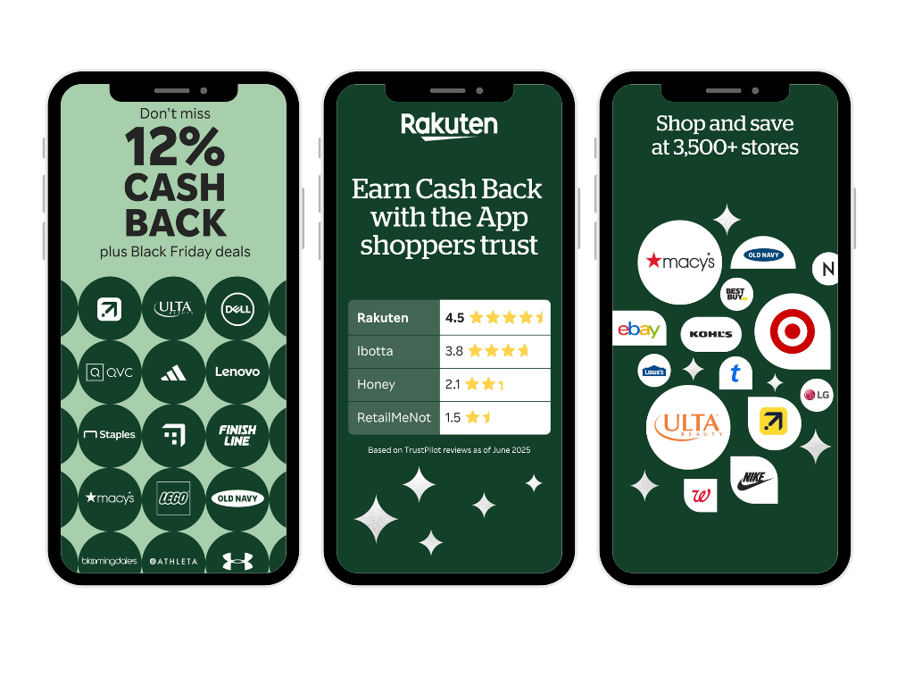
Here’s a good example from the Rakuten app. Rakuten provides a strong example of translating an existing feature into a timely outcome. Rather than leading with a broad message about earning rewards, the screenshot foregrounds up to 12% cashback alongside Black Friday deals. The feature itself has not changed, but its seasonal value is immediately clear: shoppers can get more from purchases they may already be planning to make.
The aim is not to force a Black Friday reference into every frame. It is to show that the app understands the context in which the user is making a decision. If the seasonal wording feels stretched or does not reflect a genuine product benefit, a stronger evergreen message may be more credible.
Make the first screenshots work harder
Users should not have to swipe through the full gallery to understand the main value. The opening screenshots need to do the heaviest conversion work, especially when seasonal campaigns are sending people to the listing with a specific expectation.
The first frame should answer a simple question: “Why is this relevant to me now?” The second should deepen the proposition rather than repeat it. Together, they should give the user enough information to continue exploring or feel confident enough to install.
Let’s use an example. For a cashback app, the first frame might focus on gaining more value from seasonal purchases. The second could show the breadth of participating retailers or how rewards are earned. For a budgeting app, the first frame might promise greater control, while the next demonstrates a simple view of categories, alerts or limits.
Clarity matters more than squeezing in every selling point. Shorter headlines, legible product screens and one main idea per frame make the sequence easier to process. Seasonal styling can help attract attention, but it should support the message rather than compete with it.
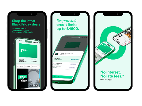
Here’s a great example from Zilch. Zilch shows how the opening frames can work together instead of competing for attention. The first establishes immediate relevance with “Shop the latest Black Friday deals”, while the second and the third move beyond the seasonal hook to introduce clearer product benefits: “Responsible credit limits” and “No interest. No late fees.” The sequence takes users from why the app matters now to a reason they might choose it, without trying to communicate every feature at once.
Match the store experience to the user’s intent
Not every user arriving on the store will be interested in Black Friday. Some may be looking for an app’s everyday value, such as managing spending, earning rewards or tracking repayments. Replacing the main store listing with seasonal creative can make the experience more relevant to campaign traffic, but less relevant to users arriving with a different need.
This is where Custom Product Pages on iOS and Custom Store Listings on Google Play come in handy, as they allow app marketers to create a more targeted journey. Black Friday campaign traffic can be directed to a dedicated page with seasonal screenshots and messaging, while the main store listing continues to communicate the app’s broader, evergreen value.
Custom pages can support organic discovery too. On iOS, relevant keywords can be assigned to a Custom Product Page so that it can appear in search results for those terms instead of the default page. On Google Play, Custom Store Listings can target users searching for specific keywords. This could allow a dedicated Black Friday experience to reach users already demonstrating seasonal intent, while other visitors continue to see the main listing.
“Not every user arriving on the store will be interested in Black Friday. A dedicated Custom Product Page or Custom Store Listing can align seasonal creative with campaign traffic and relevant search intent, while protecting the main listing for users who want to understand the app’s broader value.”
Stephen Cooper, ASO Manager
The main listing can still provide an initial testing environment. Product Page Optimisation or Store Listing Experiments can help establish whether Black Friday messaging improves conversion against the current creative.
Use trust as part of the conversion story
Finance apps face a higher trust barrier than many other categories. A timely offer may create interest, but users still need confidence that the app is credible, transparent and suitable for the decision they are making.
Our latest research report The New Rules of App Growth, Yodel Mobile’s study into 4,000 app users, found that 30% of consumers trust apps that have transparent pricing, easy cancellation, and clear privacy information. This makes reassurance more than a supporting detail. It is an important part of the conversion journey.
“The opportunity is to identify the trust signals that matter most, whether that is ratings and reviews, brand familiarity, transparent fees or clear repayment information, and make them visible at the moments when consumers move from discovery to decision.”
Megan Dean, Strategic Growth Director
In practice, the right proof should sit close to the claim it supports. If a frame promises effortless cashback, show how rewards are earned and withdrawn, including any relevant timings or conditions. If it promises greater control, show the dashboard, alerts or budgeting rules that make that control possible. The aim is not simply to tell users that the app is trustworthy, but to give them clear reasons to believe the promise being made.
Discover The New Rules of App Growth and learn more about the signals that shape app discovery, evaluation and choice.
Keep the ad, store page and product promise aligned
A seasonal screenshot works best when it continues the story that brought the user to the listing. If an ad promotes cashback at selected retailers, the store page should make that benefit easy to recognise. If the campaign focuses on spending control, the first screenshots should not suddenly switch to an unrelated feature such as international transfers.
Decide whether seasonal screenshots are worth the investment
Not every finance app needs a complete Black Friday redesign. Seasonal screenshots are most useful when Black Friday changes user demand, the app has a relevant proposition, and the team has enough time to prepare, review and test the assets properly.
A lighter update may be enough when the core benefit is already highly relevant. Reordering the gallery, rewriting the first two headlines or creating a tailored page for seasonal traffic can have more strategic value than applying Black Friday branding across the entire listing.
Before committing resources, consider whether Black Friday creates a meaningful change in user intent for your app.
This makes the decision commercial rather than cosmetic. The goal is not to look seasonal. It is to improve the relevance and persuasiveness of the store experience for a defined audience.
Test motivations, not just visual variations
The biggest screenshot mistake finance apps make during seasonal periods is making no changes at all or making changes without testing them.
Screenshot tests are often most useful when they compare different reasons to install, but visual tests still have an important role. For example, if a large proportion of the target audience uses dark mode, changing the screenshot background could have a meaningful impact on conversion. The right approach depends on the hypothesis: visual tests can improve how a message is received, while proposition-led tests help identify which message is motivating the install.
For a finance app, strong test concepts might compare:
- Control versus rewards
- Saving money versus avoiding overspending
- Speed and convenience versus visibility and reassurance
- A seasonal outcome versus an evergreen product benefit
- Feature-led messaging versus proof-led messaging
We recommend preparing your creatives in October, and running tests when consumer interest in Black Friday and Cyber Monday begins to rise. Wherever traffic is limited, use other evidence too: paid creative results, search trends, community intelligence like Reddit, reviews, customer-support questions and previous store performance can all help narrow the hypotheses worth testing.
Success should not be judged by install conversion alone. A message can persuade more people to download while attracting users who are less likely to activate, fund an account, make a first transaction or continue using the app. The strongest creative connects store conversion with the meaningful action the business needs users to take next.
A practical framework for Black Friday finance screenshots
Effective Black Friday screenshots start with a clear understanding of the user’s immediate need, then build a persuasive story around it. This six-step framework can help you guide the process from identifying user intent to testing the finished screenshot sequence. To illustrate this better, we used a cashback app as an example.
| Step | Question to answer | Cashback app example |
| 1. Intent | Why is the user considering the app now? | They want to get more value from purchases they already plan to make. |
| 2. Proposition | Which benefit best answers that need? | Earn cashback on Black Friday purchases. |
| 3. Proof | What will make that promise credible? | Show participating retailers, available cashback rates or how rewards are tracked. |
| 4. Sequence | What does the user need to understand next? | How to activate an offer, make a purchase and receive cashback. |
| 5. Consistency | Does the store page match the campaign and app experience? | The cashback offer and retailer featured in the ad also appear in the opening screenshots and app. |
| 6. Learning | What strategic question should the test answer? | Does cashback-led messaging attract more valuable users than a generic money-saving message? |
Turn seasonal attention into more valuable users
Black Friday can bring finance apps closer to users at a moment when financial decisions feel especially immediate. But seasonal attention only becomes useful when the store page makes the app’s value easy to understand and believe.
The strongest screenshots will not simply announce Black Friday. They will reflect the user’s goal, translate product features into timely outcomes and provide enough proof to support a confident decision.
That is the difference between a seasonal creative update and a strategic conversion plan. One changes how the listing looks. The other helps the right users understand why the app is worth choosing, then carries that promise into the next stage of the journey.
To make your seasonal store presence part of a wider conversion strategy, speak to Yodel Mobile’s ASO team. We can help you develop and test screenshot creative that reflects user intent, communicates value clearly and supports growth beyond Black Friday.








5 minute read
A history of app marketing, as told by a founder who was there before day one
Mick Rigby